


Our Thinking Wed 14th March, 2018
The power of visualisation, part 4: risks
If you haven’t already, I recommend you read the earlier parts of this blog series – explaining our project, and how we visualised stories and blockers – before this article.
Here, I’ll cover a very simple way to visualise risk at the outset of a project, and how this helps to mitigate bottlenecks (and potentially avoid them altogether).
Back to the start
When our team first formed, there were initially two of us (a Business Analyst, and me). We had six months to form a team and release new versions of two large applications, which required a lot of complex changes.
At a stretch, we’d be able to lean on some external teams for help – but for that to work, we’d need to be extremely clear about what help was required. We didn’t have this knowledge at the outset.
Consequently, as we grew the team and developed our understanding of the domain and the need, we had to quickly and iteratively gauge what was realistically achievable, and what risks we faced.
We also wanted to share a clear, visual view of risk as early as possible, to mitigate and avoid any actual risk to the delivery. We could then improve our view of the risks as we learned more, and as our delivery capacity increased – enabling us to relax or tighten our contingency plans as appropriate.
Creating a visual mitigation plan
To create an early view of the risks and determine any required mitigation plan, we had to discover what risks there actually were as a starting point. Obviously this view would develop as the delivery progressed – but getting the basics down was vital to start with.
Was this a two-year piece of work, or two weeks? Was there a possibility of being late? If so, what specific help would we need from an external team?
To answer these questions and more, we set up a framework that we could trust to guide our risk mitigation (now and in the future), and which would be easy to communicate to the wider business. We opted for a simple visual approach based on the principle of story relative sizing.
- To begin with, we needed a benchmark – our view if all went well and all our assumptions proved to be true. To avoid extensive business analysis, we opted to develop a solid understanding of what work was required at the product’s Epic level. We couldn’t lose time analysing lots of stories at this stage.
- We then relatively sized those epics based on our understanding of their complexity. This wasn’t precise, but that was fine – it easily expressed the uncertainty inherent in our estimates.
- We then ordered these epics by business priority (based on cost to the business if they didn’t go live on time).
- We then stacked these sized and prioritised epics sequentially, mapped against the time we had until go live.
This created a (very) high level, ‘happy path’ view of our work to come. We had this helpful visual representation of the delivery as our starting point:
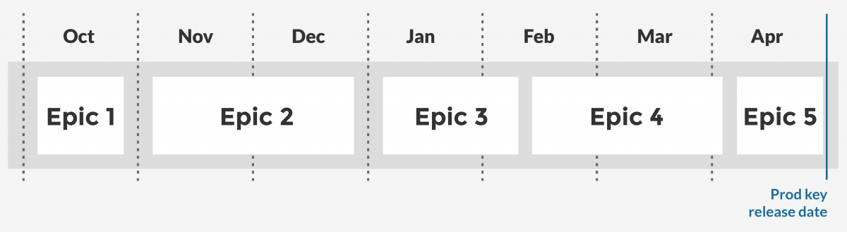
If our sizings and priorities held true and nothing else changed, all we had to do was deliver each epic within the timescales of this forecast. Easy, eh?
We then got on with delivery, with the BA focused on analysing the priority epic and driving out stories to be delivered by the team.
Other than working on the priority epic, we didn’t take what we’d learned from our sizing or time mapping into our iterations. In other words, we didn’t burden the delivery team with proposed delivery dates based on this visualisation. After all, these were not precise delivery dates, and this was not a plan. It was simply a visual map, to aid future mitigation planning.
Learning and evolving the plan
After we’d delivered the first epic, we compared how long it had taken compared to the benchmark proposal. We factored in whatever new things we’d learned about the delivery, (changes in scope, priorities, delivery constraints, etc). We quickly learned that, all things considered, it had taken more than twice as long as benchmarked to deliver the first epic.
At a very high level, we could extrapolate that if things didn’t change, we had very little chance of hitting the deadline.
We quickly recommended that an external team should take on some of the delivery, and our early Epic analysis made it possible to recommend which Epics that team should take. However rudimentary our visualisation, the approach enabled us to mitigation plan very early on.
In the event, as the delivery progressed, our team grew and aspects of the delivery proved to be less challenging than initially predicted. This enabled the team to pull back the epics it had handed off, and the team was able to deliver the full release without external support. Either way, it was good to have planned for a less rosy scenario.
Lessons learned
Our team worked best when stress and pressure was managed. By keeping a close eye on the bigger picture, this visualisation enabled us to quickly recognise and mitigate risk and enable the team to focus on the work currently in hand. This also helped to create the time and space needed for the team to instill solid delivery principles as it grew.
In turn, we were able to increase our productivity and delivery performance – which meant that much of the risk we’d mitigated for never materialised.
This relative sizing and time mapping of Epics is quick, easy, and efficient. It’s highly visual and is easy to communicate to external stakeholders. And it’s another great example of how visualisation can really aid progress.
That brings us to the end of this series, and I hope it’s been useful. If there’s one takeaway, do consider visualising aspects of your team’s work and the context in which it’s happening whenever you can; it’s an investment that will repay you many times over.
Part 1 – the power of visualisations
Part 2 – visualising stories
Part 3 – visualising blockers
Part 4 – visualising risks (you’re here!)