I recommend you look at those before reading this final instalment, where we’ll be looking at how to visualise the time taken to complete work. I’m going to use the term Cycle Time as the name of the metric that tells us how long we take to complete work; whether Cycle Time is the appropriate term, and how it differs from Lead Time is out of scope for this post! Whichever term you prefer, it’s how you use the underlying data that’s important.
Disclaimer: I am not a statistics expert! In the example below we’ll use some basic arithmetic to calculate percentile values of Cycle Times, but that’s as far as I go.
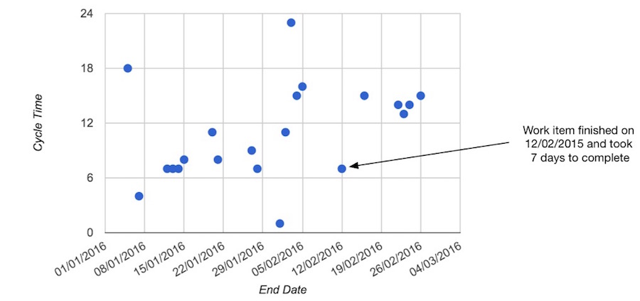
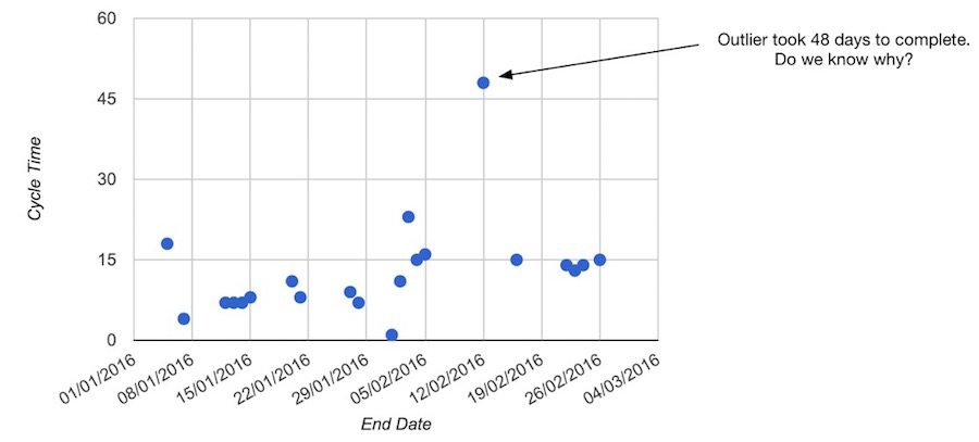
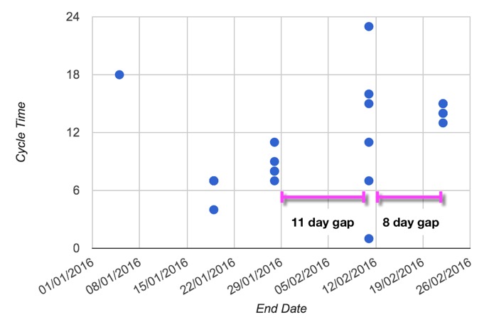
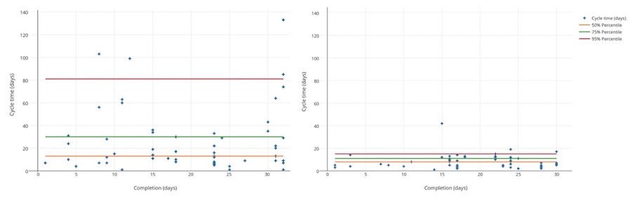
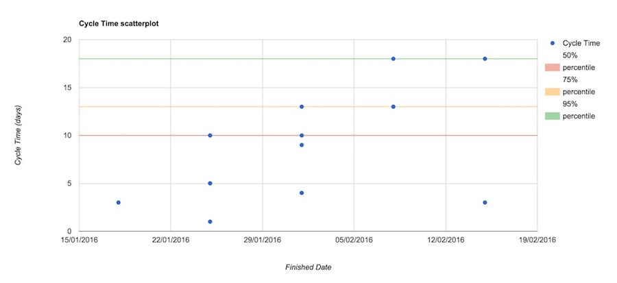
There are different ways to visualise your data. In this example, I’m going to use a scatterplot to show the Cycle Times for completed work items, plotted against the date when the work finished. I find this easier to interpret than a histogram.
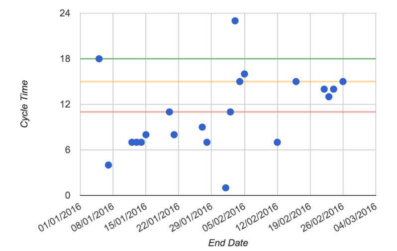
You can use this information when reviewing your team’s past performance, to help identify outliers (i.e. work items that took much longer to complete compared to others):
It can also help you spot gaps in delivery (you can check this against the data in your cumulative flow and throughput charts too):
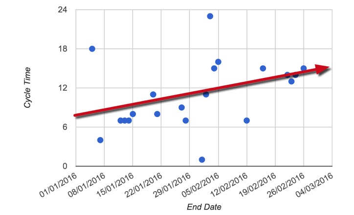
It also helps you review the overall trend in Cycle Time, to see if it’s increasing or decreasing. The example below shows the Cycle Time trend increasing over time (which might occur if the team is committing to start more work).
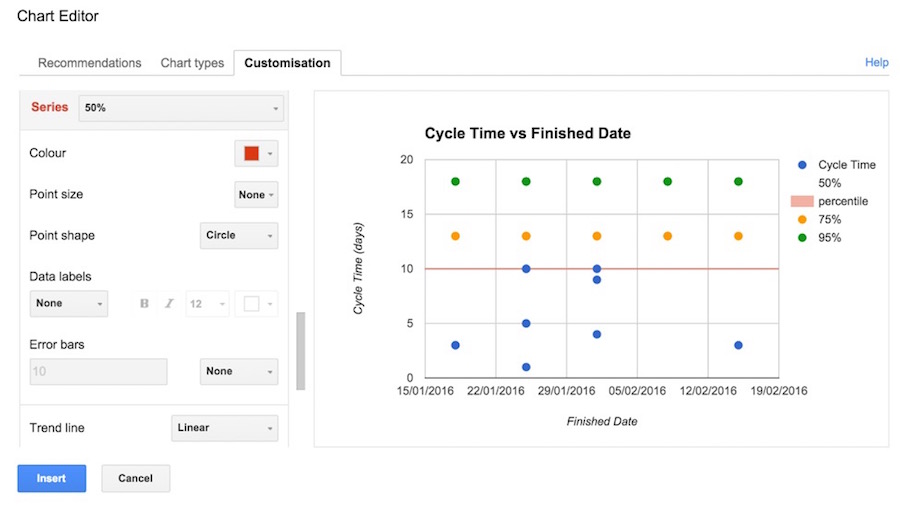
You can also add in percentile bands to highlight the differences and variability across the data (we touched upon this in a previous post). In the example below, the 50th, 75th and 95th percentiles are represented by the red, orange and green line respectively:
One way to use these is to look at the spread between each percentile. A significant difference might mean you will have trouble predicting how long a future work item might take to complete. If the spread is narrow, then you can say with some confidence that the next work item will probably finish within the 95% percentile.
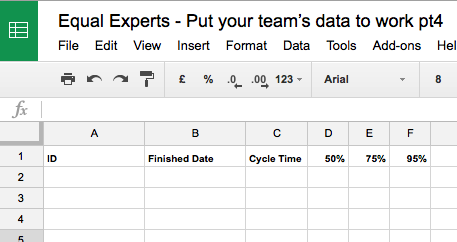
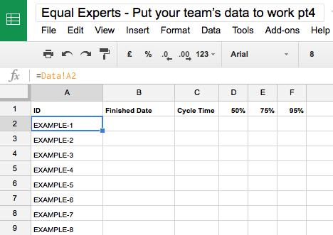
2) Add the following header columns (starting in cell A1):
A
B
C
D
E
F
ID
Finished Date
Cycle Time
50%
75%
95%
3) Link the ID column to data by setting A2 as =DATA!A2 and copy/fill down as needed.
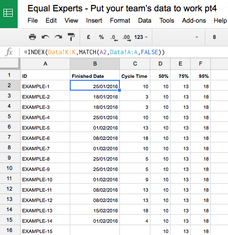
4) Now add the following formulas to calculate the data that will populate your scatterplot:
Add the lookup formula =INDEX(Data!K:K,MATCH(A2,Data!A:A,FALSE)) into B2 to find and display the end date for the work item listed in A2;
Add a similar formula =INDEX(Data!I:I,MATCH(A2,Data!A:A,FALSE)) into C2 to display the Cycle Time for the work item in A2;
Add the formula =ROUNDUP(PERCENTILE($C:$C,D$1),0) into D2 and copy/fill right into E2 and F2;
Copy/fill down columns B and C until you get to the last work item
Set D3, E3 and F3 as =D2, =E2, and =F2 respectively then copy/fill down.
5) Select columns B to F in the sheet and insert a Scatterplot chart (if you’re using Google Docs, you’ll need to add a trendline to the percentile values in order to show the horizontal bars).
And that’s it – your chart will now show your Cycle Time data, ready for review.
Thanks for reading, and I hope you found the series useful!
Get in touch
Solving a complex business problem? You need experts by your side.
All business models have their pros and cons. But, when you consider the type of problems we help our clients to solve at Equal Experts, it’s worth thinking about the level of experience and the best consultancy approach to solve them.
If you’d like to find out more about working with us – get in touch. We’d love to hear from you.