In part one of this post we created a tracker spreadsheet to capture your team’s data; I recommend you read that before you read this.
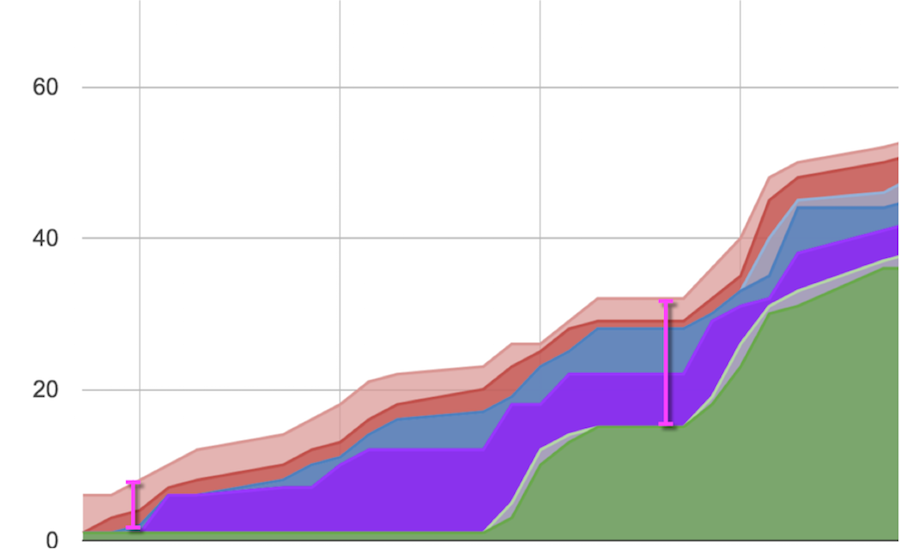
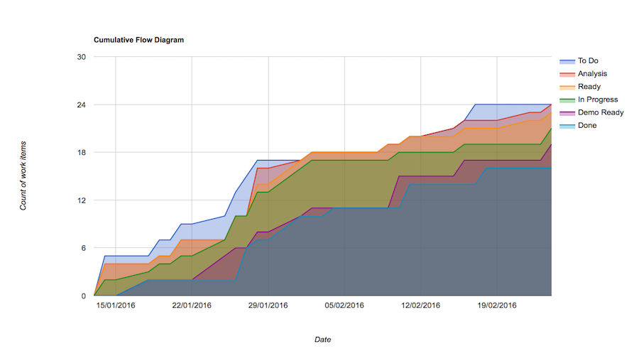
Now we’ll start putting it to good use, with a cumulative flow diagram. This chart plots the total work in progress (WIP) over time, neatly split across the states within your team’s process (in our example, these are To Do, Analysis, Ready, In Progress, Demo Ready, and Done). You can use it to see your WIP on any given day, by measuring the vertical distance between the top and bottom lines. The pink vertical lines in this example show two different WIP measurements:
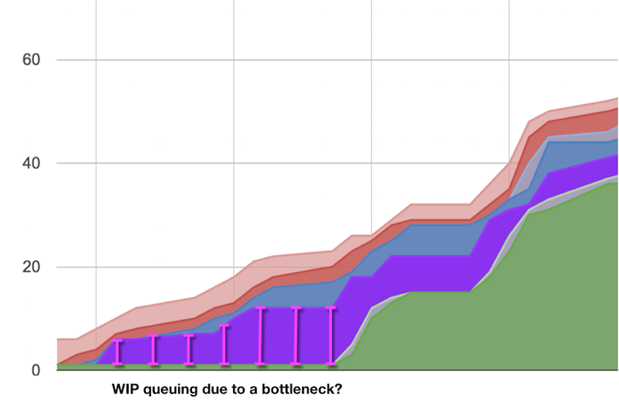
You can also use this chart when reviewing past performance (maybe as part of a retrospective). For example, you could identify and discuss the cause of a potential bottleneck:
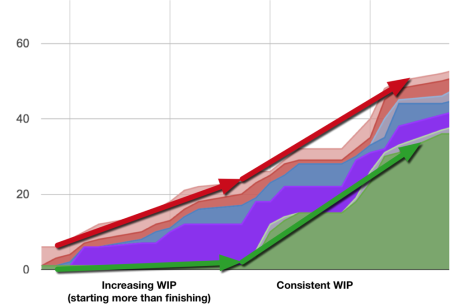
Or to assess whether you are starting more work than you are finishing:
Let’s get started
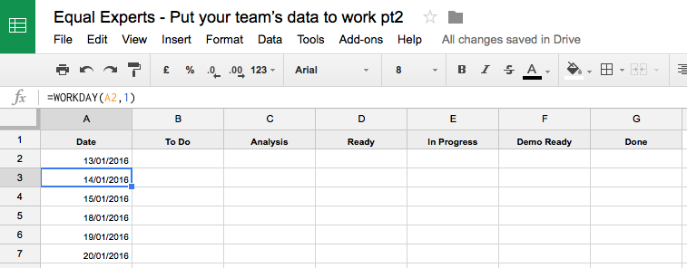
1) Add a new sheet called ‘CFD’ to the spreadsheet we made in part one.
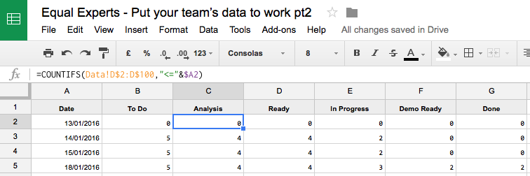
2) Add the following header columns, starting in cell A1:
A
B
C
D
E
F
G
Date
To Do
Analysis
Ready
In Progress
Demo Ready
Done
In reality, this will need to match your own process – so make sure you include all of the columns you need. You can easily keep the headings the same as on your ‘Data’ sheet by inserting the simple formula =Data!C1 in cell B1. Then apply the formula to the cells to the right of B1, across as many columns as you need.
3) Set up an auto-incrementing set of dates in the first column:
We’ll pick the day before the first work item started as our start date in A2;
Set A3 as =WORKDAY(A2,1) and fill downwards to apply the formula as far as you like.
4) Now we’ll add formulas to calculate the data you’ll need to populate your Cumulative Flow Diagram:
A
B
C
D
E
F
G
<date>
=COUNTIFS(Data!C$2:C$100,”<=”&$A2)
Set B2 as =COUNTIFS(Data!C$2:C$100,”<=”&$A2) and fill this formula to the right, for all columns in your process.
Copy/fill down until you get to today’s date (or 24/02/2016 if you’re using the example data set).
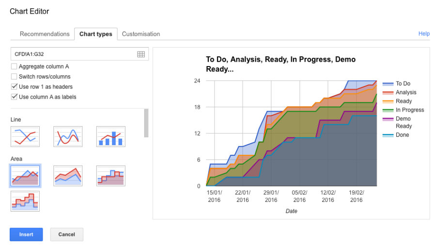
5) Select all columns in the sheet and insert an Area chart (Insert > Chart in Google Docs).
6) The chart will use your data to make your Continuous Flow Diagram. The diagram based on our example data set is shown below. Have a think about what a chart like this might reveal from your own team’s progress…
Hope you find this useful! In part three, we’ll be adding support to visualise your team’s throughput.
Solving a complex business problem? You need experts by your side.
All business models have their pros and cons. But, when you consider the type of problems we help our clients to solve at Equal Experts, it’s worth thinking about the level of experience and the best consultancy approach to solve them.
If you’d like to find out more about working with us – get in touch. We’d love to hear from you.