In parts one and two of this post we created a spreadsheet to capture your team’s data and a Cumulative Flow Diagram based on the data. I highly recommend you read those before this.
Visualising Throughput
You can measure your team’s Throughput as the number of work items completed in a given time period. Typically, this would be a count of the work items you’ve completed each week, but you could conceivably measure it in days, sprints or whatever works best for you. You might also want to break down work items into specific types (e.g. user stories versus defects).
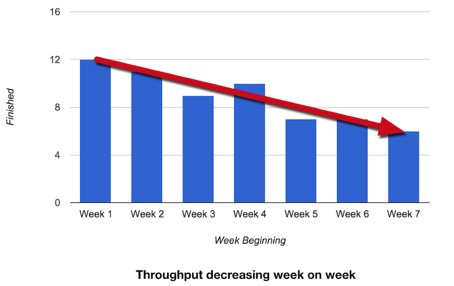
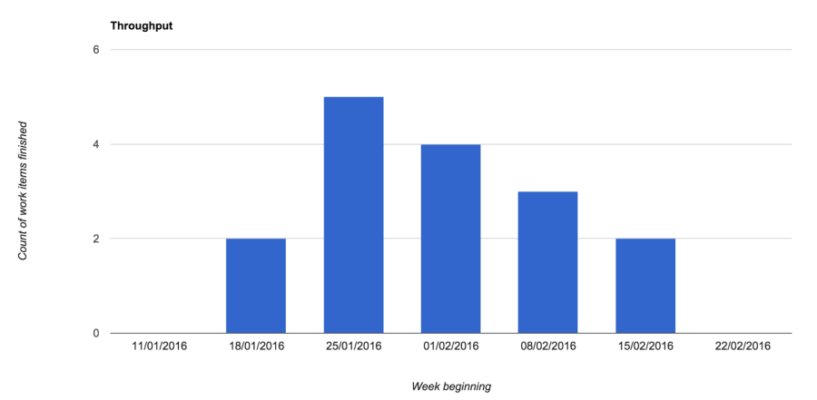
In this example, we’ll be tracking the total number of work items completed in a week, via a chart. As the information builds over time, you can use it to discuss and understand the Throughput trend of your team. For example, the chart below shows the trend decreasing – this could prompt a discussion in a retrospective, to understand what might be causing it:
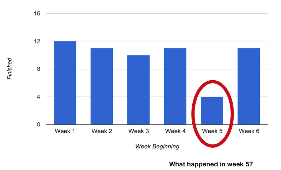
Or, you might want to discuss the causes of an outlier in your normally-consistent Throughput trend, like this:
You can also use this data to make a very rough prediction on the number of weeks remaining to complete a given set of work items (see the footnote in my earlier post – Why is the work taking so long? – for a little more on this).
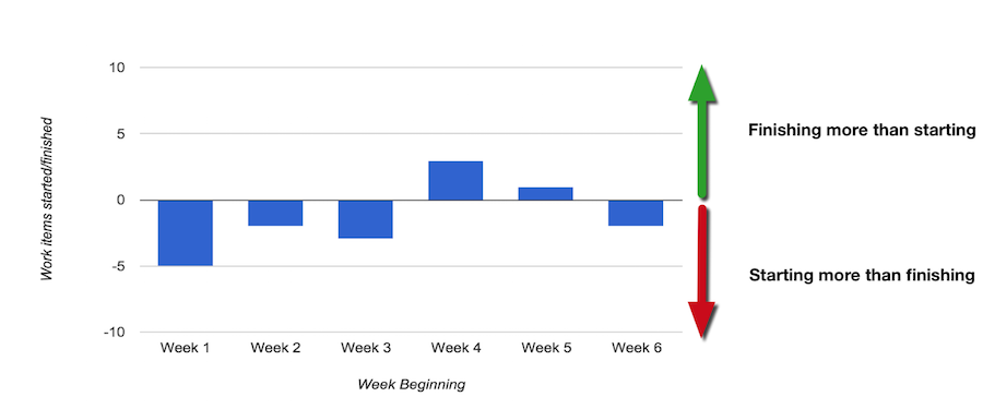
This time, we’ll create two visualisations of our data: our Throughput and the Net Flow. The latter is an interesting chart (originally proposed by Troy Magennis) that, at a glance, shows whether you are starting or finishing more work over time. Good to know!
Let’s get started.
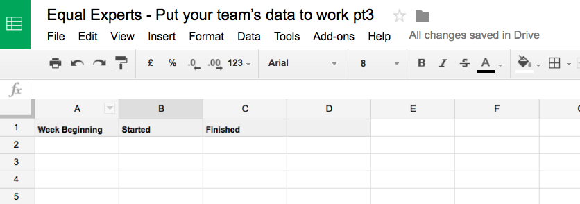
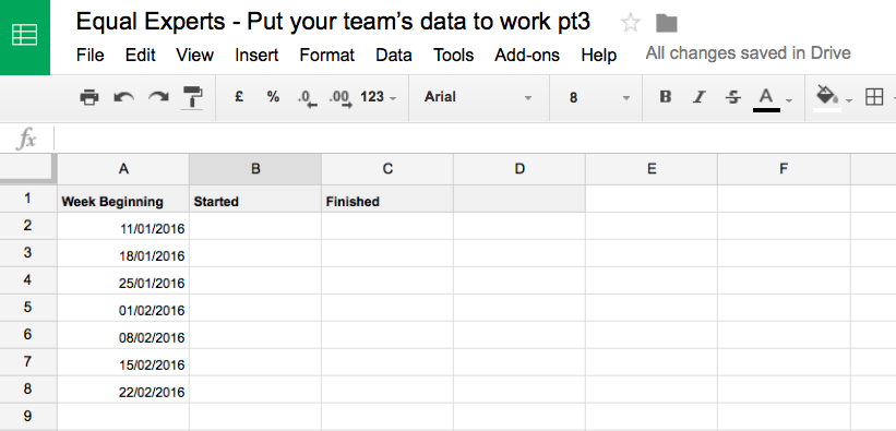
1) Add a new sheet called ‘Throughput’
2) Add the following header columns (starting in cell A1):
A
B
C
Week Beginning
Started
Finished
3) Next, set up an auto-incrementing set of dates in the first column:
We’ll pick the Monday before the first work item started as our start date in A2;
Set A3 as =WORKDAY(A2,5) and fill downwards to apply the formula as far as you like.
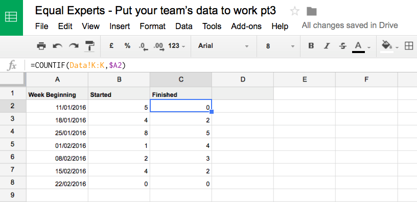
4) Now, add formulas to calculate the data that will to populate the chart:
A
B
C
<date>
=COUNTIF(Data!J:J,$A2)
Set B2 as =COUNTIF(Data!J:J,$A2) and copy/fill this formula to the next cell.
Copy/fill down until you get to the most recent Monday
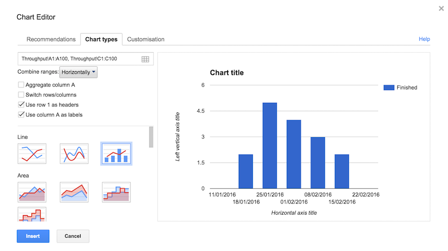
5) Now we can make our first chart: just select columns A & C in the sheet and insert a Column chart (Insert > Chart in Google Docs). You might want to customise the title and axis names as well.
Let’s make the net flow chart
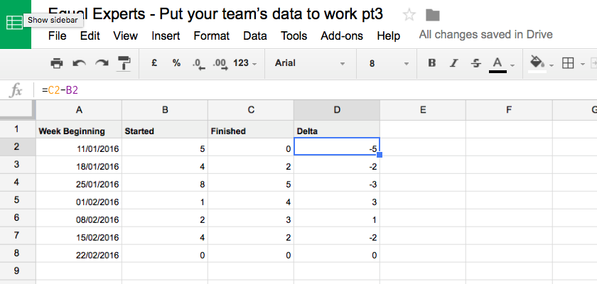
1) Add an extra header column next to ‘Finished’ called ‘Delta’.
2) In D2, add the formula =C2-B2 and fill/copy down as needed.
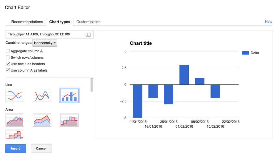
3) Select columns A and D in this sheet and insert a Column chart (Insert > Chart in Google Docs). Again, customise the title and axis names as needed.
You now have your Net Flow chart!
In the fourth and final part of this series, we’ll be adding support to visualise Cycle Time – and the chart will be a powerful, useful tool for visualising your team’s data.
Solving a complex business problem? You need experts by your side.
All business models have their pros and cons. But, when you consider the type of problems we help our clients to solve at Equal Experts, it’s worth thinking about the level of experience and the best consultancy approach to solve them.
If you’d like to find out more about working with us – get in touch. We’d love to hear from you.