The Business Evolution Map, Part 1 – Dealing with disruption
This is the story behind the Business Evolution Map, a unique tool developed by the Equal Experts Strategic Advisory Practice to bring predictability to the apparently unpredictable. If you’re looking to diversify, or wondering where the next threat is really coming from, this is the tool for you. Tested, and logical, it provides insight and guidance, free from human bias and hidden agenda.
What is it?
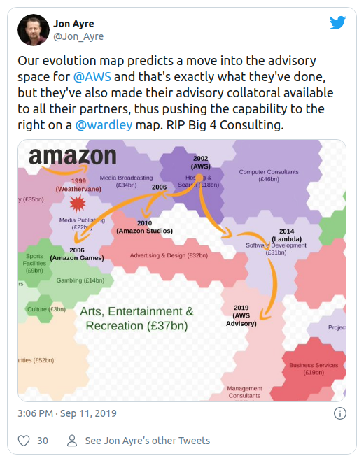
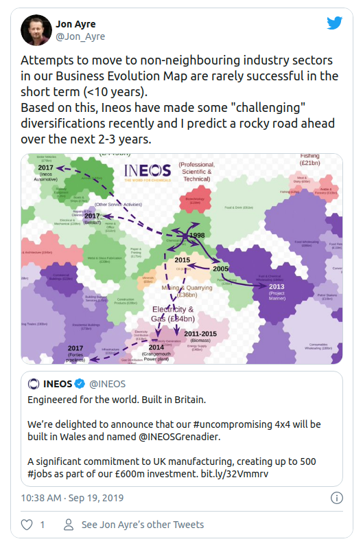
Simply put, the Business Evolution Map is a pictorial representation of the economy, laid out in such a way that helps show which journeys into new sectors are likely to succeed, and which are destined for failure. You may already have seen some examples of its use via twitter; if not and in the interests of “show not tell” here they are:
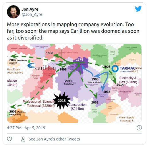
Each one of these examples shows a small portion of the Map and traces the diversification journeys of three very different companies. In each case, the success or failure of the endeavour correlates with the predictions of the Map. The first explains where Carrillion went wrong, the second predicts success for Amazon (not surprisingly), and the third predicts failure for Ineos.
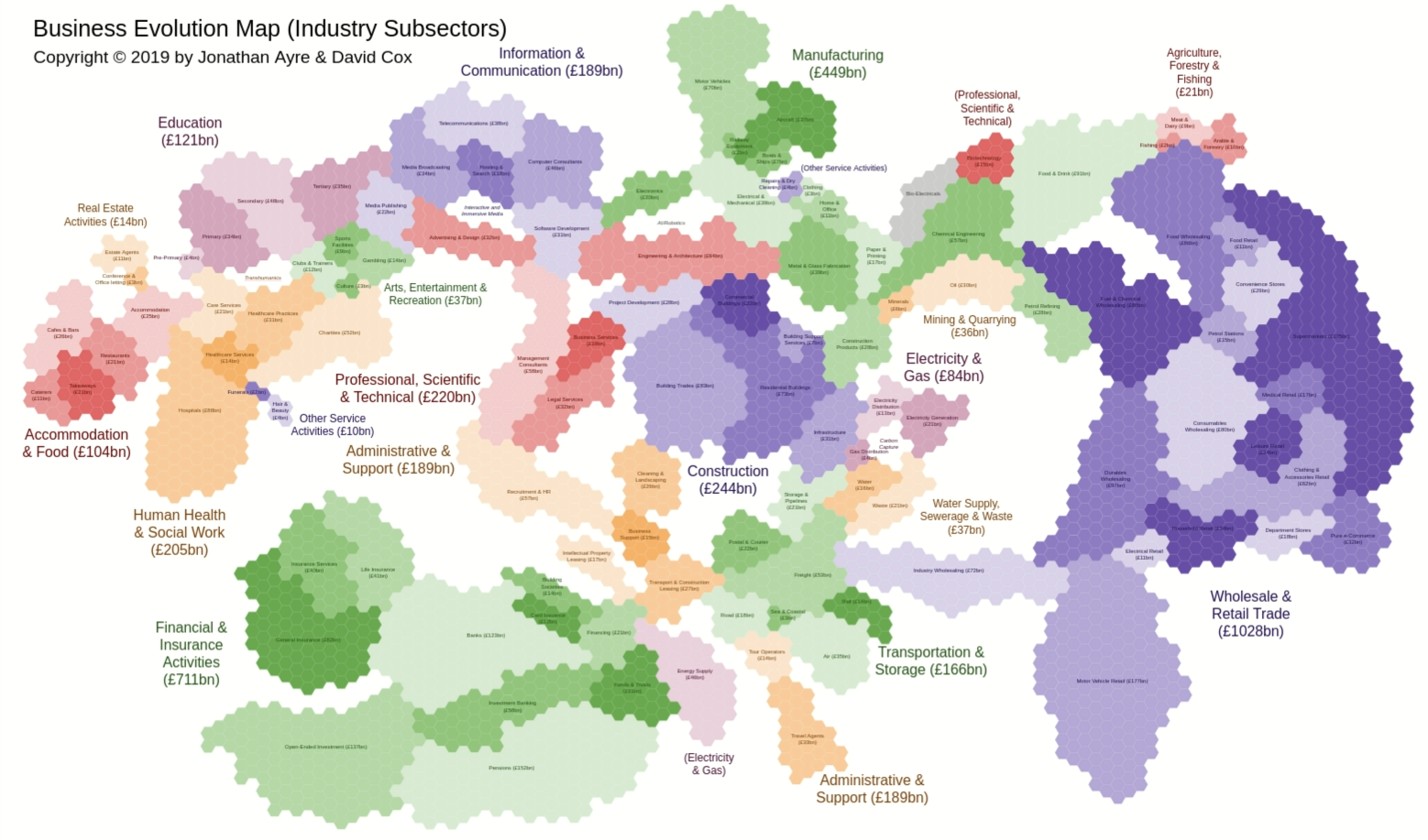
The regions of the Map represent business sectors, and the countries within each region represent the sub-sectors. The countries are then laid out in such a way that the boundaries represent the points at which these sectors merge.
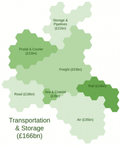
These boundaries are dictated by the people involved in the related businesses, and more specifically their skills, mindsets and networks. Take, for example, the Transportation & Storage sector; at the heart of this is the Freight sub-sector, and the other sub-sectors then cluster around it.
By structuring the Map in this way, we have created a tool which predicts that diversification into neighbouring “countries” will be successful (typically within 3 years), whilst attempts to jump across the Map to disconnected business sectors will be no more successful than a brand new start-up (taking up to 10 years or more to achieve the same level of success).
In other words, if you want to leverage the people and capabilities of your existing business and you want success within a three year window, then you need to focus your attention on your nearest neighbours. This doesn’t mean you can’t augment your organisation with capabilities elsewhere on the map, but it does guide you towards a partnership arrangement, or potentially an “acquire and run at arms length” approach.
In the beginning
We created the Map because we believed there was a lack of true understanding or insight into why attempts to diversify either failed or succeeded. There are, of course, many convincing stories told about how companies moved into fundamentally different business sectors, always with a claimed reason for that success, but it appeared to us that those stories started with a conclusion, and then cherry-picked the stories that could be fitted to that conclusion. As we looked across those stories it was clear that each one proposed a different reason, and not surprisingly, the reason was often related to the product or offered by the author.
It was also clear that consultants were advising companies to diversify into sectors that seemed to be connected at first glance, but on closer inspection, these connections were being inferred from the similar words used to describe them. Wellness and Pharmaceuticals were a good example; both made frequent use of language such as “health” and “wellbeing”, but it was our opinion that, although these businesses were involved in a similar outcome, the fundamental nature of what they did was very different; one provided care, whilst the other manufactured medicinal products.
Therefore, the Map started where most innovations do, with a problem to be solved, and also from our personal need to bring an idea to life visually so that it could be clearly communicated, discussed and challenged. What we needed was a solution to this problem, and as is the Equal Experts way, we started with a ‘Bet’ and a hypothesis.
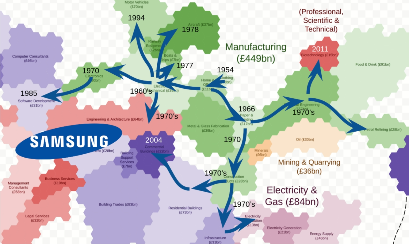
The Bet was that it would be possible to create something akin to a geographical map onto which company journeys could be plotted, and chances of success judged using the physical distances travelled. The hypothesis was that success or failure of diversification (judged relative to a complete start-up venture) was fundamentally driven by the capabilities of the people within the existing company. We envisaged something like this early concept drawing, but much larger:
It’s all about me!
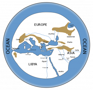
We started, much as the early European explorers did; from familiar territory. Much of what Equal Experts does involves software development, and so it was easy to chart our immediate surroundings, but beyond that was uncharted territory. Our Map, useful though it was in its own way, was much like this very limited picture of the “known world”. Some bits were likely to be reasonably accurate, and others complete conjecture, not to mention the greater parts that didn’t even appear at all.
The next bit took time and some significant working and reworking. Let’s just say that whiteboards were involved and coffee was drunk. Along with the coffee, a huge amount of data was consumed covering the entirety of the UK economy, although the Map works as well in its final form for any of the world’s economies, as it has people as its main driver.
The most important data to us were the relative sizes (by revenue) of each of the sectors, and the core activities undertaken by businesses in those sectors. The former gave us the relative sizes of each country (we used one hexagon per £1bn revenue), whilst the latter allowed us to position each of the countries so that their edges matched, much like assembling a jigsaw without the guiding picture. There is, of course, a lot more detail in the final version of the Map, but here is a bird’s eye view to give you an idea of scale:
Testing the hypothesis
As the Map had been formed from a hypothesis, it needed to be proven, and to be properly tested we needed to use information it was intended to predict, not information from which it was created. For this we turned to those original stories of diversification, and for each one we mapped out the journey in chronological order, making note of successes and failures.
Our intent was to further “tweak” the Map based on our findings, but we were surprised to find far greater correlation than we ever expected. Clearly those long hours trawling for data and arguing in front of a whiteboard had been worth it after all. There are many examples of companies that got it wrong, but to save their blushes, here is an example of one that got it spectacularly right:
As you can see, every move made is between two neighbouring countries. It’s difficult to comprehend how a company that started out making clothes ended up making just about everything, and played a key role in the building of the Burj Khalifa, the tallest building in the world. There’s a lengthy story to tell here, but for the purposes of this blog post, suffice to say, the map makes it much clearer how a textile company comes to dominate so many apparently diverse business sectors, without the need to fundamentally “reinvent” itself, as some might have you believe.
Putting the Map to use
As well as using the Map to gain insights for Equal Experts and guide our own investments and decisions, we also use it to help our clients understand where they truly are as a business (semantics aside), where they might choose to go next, and who might be coming their way. Helping clients find innovative answers to important strategic questions is what we do, and the Map is an essential tool in our arsenal to help us do that logically and effectively.
The best way to describe how we use it is probably to quote some of our clients’ questions that it helps to answer:
“We’ve grown rapidly, and now we’re too complicated. In what should we invest further and of what should we divest?”
“Having exhausted growth in our market, we want to diversify – but how?”
“Everyone is telling me that my business is about to be disrupted – is this true, and if so, by whom, and what can I do about it?”
“Disruption is so unpredictable; new business sectors spring out of nowhere and cause chaos. Is there a way to anticipate what might come next, and who is best placed to exploit those opportunities?”
Not only does the Map take the guesswork out of the strategy process; it also strips away unconscious biases and misleading semantic connections that otherwise can cloud thinking.
In part 2, we will take the journey of that well-known company, Nintendo, and illustrate, using the Map, what worked, what didn’t, and why that might be.
Solving a complex business problem? You need experts by your side.
All business models have their pros and cons. But, when you consider the type of problems we help our clients to solve at Equal Experts, it’s worth thinking about the level of experience and the best consultancy approach to solve them.
If you’d like to find out more about working with us – get in touch. We’d love to hear from you.

 We started, much as the early European explorers did; from familiar territory. Much of what Equal Experts does involves software development, and so it was easy to chart our immediate surroundings, but beyond that was uncharted territory. Our Map, useful though it was in its own way, was much like this very limited picture of the “known world”. Some bits were likely to be reasonably accurate, and others complete conjecture, not to mention the greater parts that didn’t even appear at all.