‘Garbage in, garbage out’ – we’ve all heard this phrase many times in relation to computers, but it’s even more important when it comes to human decision making.
It’s often been observed that the reason so many bad decisions are made in business is because people rely on their gut instinct rather than cold, hard facts. This has inevitably created a proliferation of supposedly ‘data driven’ strategies, but all too often, in practice this means pursuing data in the hope that it will make the decisions for you.
The problem with data, however, is that it is usually presented numerically and textually – and as sensory organs, our brains are not well suited to translating this into easily consumable insight.
The problem is in the use of words; language is, by necessity, sequential in nature. There’s no way to hear two pieces of data simultaneously, so something must come first; we also tend to interpret that which comes first as cause, and that which comes second as effect.
Also bear in mind that language is hard, time-consuming work for our brains to parse, and so to hold the attention of the listener, we tend to summarise and omit data we do not think is relevant to the conclusion. We are therefore not actually communicating the data at all; we are actually communicating our conclusion, disguised as data.
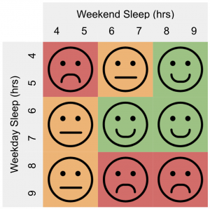
As an example of this phenomenon in action, a recent study found that people who get more than the “ideal” seven to eight hours of sleep exhibit greater levels of mortality. Cue the headlines: TOO MUCH SLEEP IS BAD FOR YOU.
A picture paints a thousand words
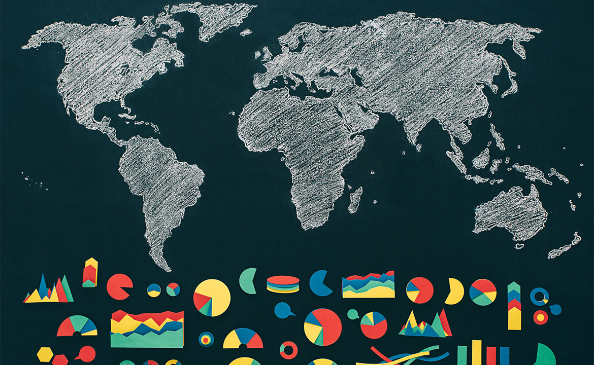
So how can we improve the way we communicate data? Pictures! Just compare these images for a moment and see from which you take most information:
For my previous example about sleep duration and mortality, anyone looking beyond the headlines would find a rather more nuanced picture (you can look at the summary text). If you read carefully you’ll discover that consistently long sleep periods, seven days a week correlate with higher mortality – as does consistently short sleep duration. However, consistent six to seven hour sleep duration, or short sleep duration during the week followed by long sleep duration at the weekend proved equal to one another.
So, if you were to act instinctively on the headline, and adjust your habits to avoid lying in over the weekend you could actually reduce your lifespan, rather than increase it.
Now, if I showed you a very simple “map” of what mortality looked like for different combinations of weekend and weekday sleeping durations, you’d quickly be able to work out where you are right now, where you might want to be, and how you might get there:
Clearly, this doesn’t make the data right or wrong – but it does make it more easy to consume, digest and challenge. All of which are essential if the data is to inform good decisions.
Diagrams are difficult
For a diagram to have meaning, the positions of the things on that diagram and the way they are represented must also have meaning – otherwise it’s just a list with pretty colours. Yet all too often, pictures are just window dressing for words and convey no additional information.
Making diagrams meaningful and useful requires serious thought, because every element of your picture will convey meaning, whether you mean it to or not. If two things are placed next to one another, the viewer will assume they are closely related, so it’s important to make sure they are. If objects on your picture vary in size, people will assume that size means something.
If a job’s worth doing…
With the above in mind, I’ve been developing a map of industry that embodies the features of size and position in a way that taps into natural human decision making, and hopefully encourages the development of effective and competitive strategies.
I’m not the only one doing this, and in parallel I would urge you to read up on Wardley Maps, a mapping concept that focuses on value chain and evolution developed by Simon Wardley (the keynote speaker at our 2017 Associate Conference). This technique is powerful when looking at what you should and shouldn’t be doing, and how to approach execution (it does, of course do more than that, but I’m summarising).
In contrast, my approach focuses on revenue spaces occupied by businesses and lays these out in a way analogous to a geographical map. This then allows strategy to be developed in a very physical way – much as a football team manager or chess player might consider different set pieces on the field of play, or a military leader might plan out a campaign to defend or take territory.
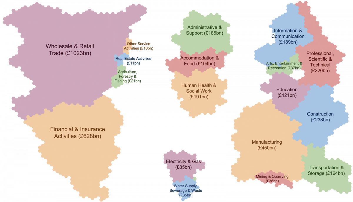
At the highest level, it allows all revenue to be mapped for an economy. In the example below the ~£4 trillion revenue of the UK economy is mapped out by industry sector, with the size of each “country” representing revenue, and position representing similarity of capability required:
This provides some basic information that might prove informative, but it only really gets interesting as far as strategy is concerned when you drill right down to the capabilities (or ‘cities’) in the map.
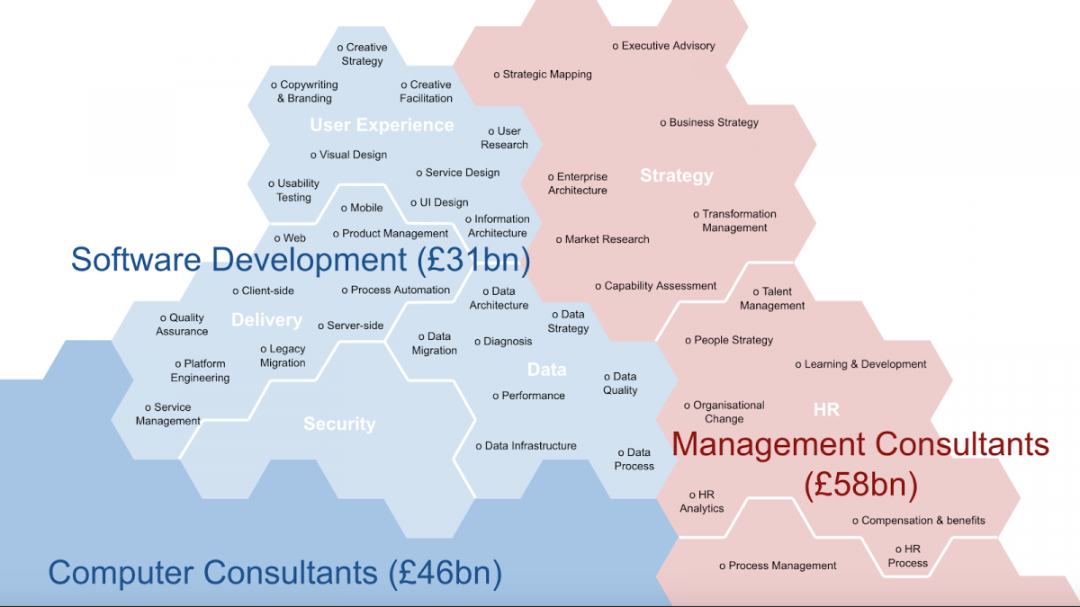
By way of demonstration, here’s some detail of the space in which we at Equal Experts operate:
How’s this useful?
Imagine, for a moment, that you are operating solely in the Software Development space, and more specifically in Delivery. The map allows you to quickly compare the size of the market in which you operate, the capabilities into which you can evolve easily, and the potential routes you can take to get to those capabilities. It also brings to life the broader territory and the neighbouring areas.
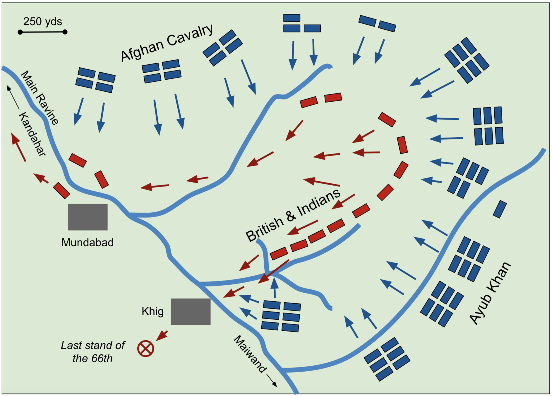
The relevance of such considerations is made clear if you compare with the following map of manoeuvres from the Battle of Maiwand (1880). Ask yourself, do you want to be blue or red on this map?
Considering the options
Suffice it to say, such a visualisation allows you to more easily identify the size and proximity of certain opportunities, as well as explore defensive and offensive strategies.
Equal Experts already operates not just in the Delivery space, but also within the User Experience, Security, Data, and Strategy areas, and we’re starting to use our business map internally within Equal Experts to further explore our future strategy. It’s creating some real eureka moments, as well as helping to reinforce some existing decisions. More importantly, it’s allowing these moments to come at speed, by making the information necessary to have those moments quickly available to a broader audience. This means we can bring more brains to the table, and easily invite a greater diversity of views.
Feed your intuition
These maps demonstrate a key principle; when done right, condensing information into a single picture can turn potentially confusing lists of data into easily consumable, actionable insight.
Carefully laying data out in an already familiar and meaningful manner creates an accessible decision making tool that anyone around the table can use with minimal training. This is essential when working at the highest levels in organisations – time is precious, and becoming well informed as quickly as possible is an executive imperative.
I framed gut instinct rather negatively at the outset of the article, but intuition has its place if you can trust it. To do that, you need to feed your senses with accurate information that you can see and feel, as well as read.
Get in touch
Solving a complex business problem? You need experts by your side.
All business models have their pros and cons. But, when you consider the type of problems we help our clients to solve at Equal Experts, it’s worth thinking about the level of experience and the best consultancy approach to solve them.
If you’d like to find out more about working with us – get in touch. We’d love to hear from you.