I’ve recently been working with a client in the world of investment banking (specifically, involved in securities trading). As part of our work there, I was tasked with helping to make it easier for the business’ staff and clients to easily monitor – and understand! – the myriad data required to make informed decisions.
It proved to be another reminder of how making something truly simple is far from straightforward – and of how iteration and close collaboration with the user is the way to crack a tough problem.
Our users live their working lives surrounded by dense information, and data visualisation is everywhere. Believe me, these people are used to reading graphs – some have eight screens on their desk! But no matter how good they are at interpreting data, the fast-paced nature of their work means that simplicity is still key. To provide a really valuable decision-making tool, we wanted to show the essential information at a ‘don’t make me think’ level of simplicity.
Simple – in theory
While we worked on several different visualisations, the one we had the most difficulty with was a graph to clearly show net and gross earning and costs.
Sounds like it would be a common thing to want to show, right? Our users certainly wanted it, but surprisingly couldn’t point to a good example. And sure enough, our own research couldn’t unearth a really simple, clear graph that relayed the most important figure, net earnings, clearly enough.
Additionally, ‘out of the box’ solutions we investigated often exhibited quite unexpected or overly complicated behaviour – introducing the risk of disorienting rather than informing the user.
The closest our research turned up was an answer at the bottom of a Stack overflow thread – but this didn’t show the most important data for our audience (net profit) simply enough:
If you want something done properly…
With Edward Tufte’s pioneering emphasis on minimalism in mind, we set about designing our own graph.
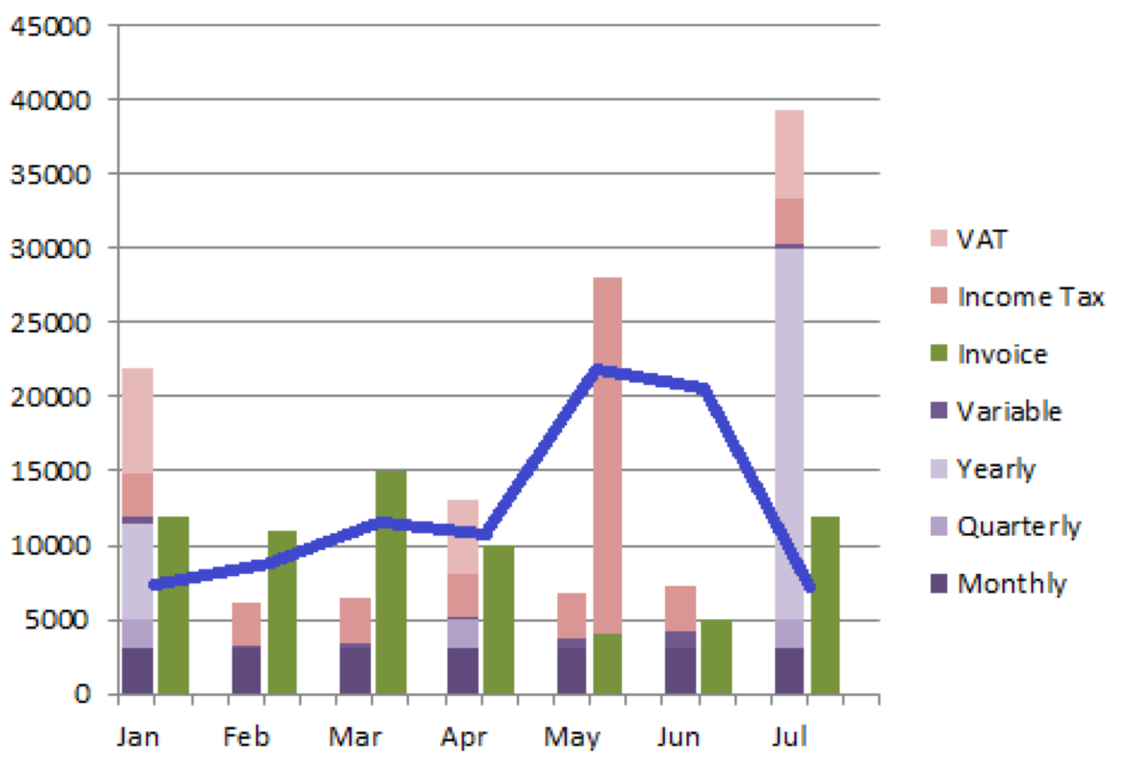
For the first iteration, we came up with this to show costs:
Meanwhile, this version showed profit (earnings minus costs):
This wasn’t successful because we were trying to cram too much data into the one graph. Although we did want to show the makeup of the costs, it led to us relying on lots of extra visual tools and formatting for the various different states. Clearly it wasn’t meeting our goal of ‘at a glance’ information.
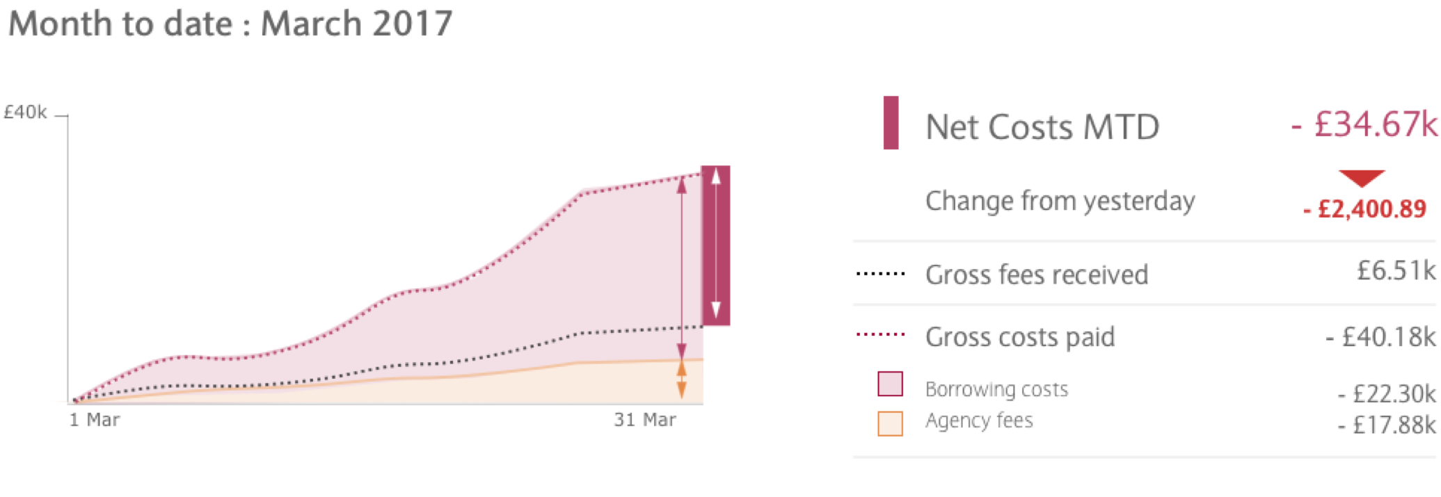
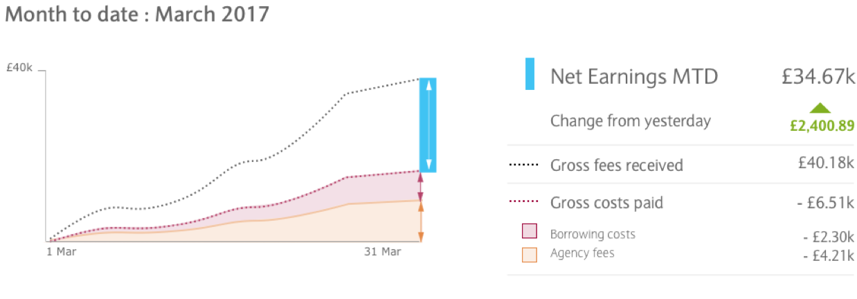
So we went back to the drawing board and came up with this version:
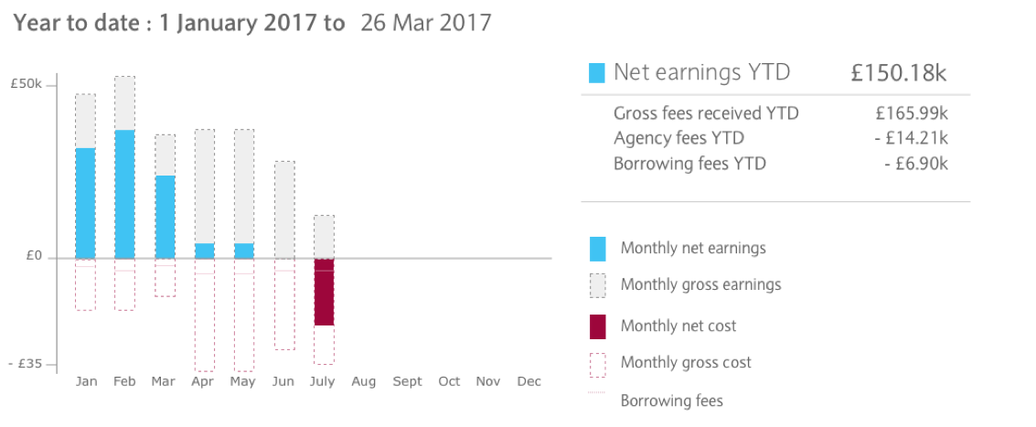
The equivalent Year to date chart more closely resembles the graph at the bottom of the stack exchange thread, but shows the net profit more clearly. However, neither view was satisfactory. Although they clearly show earnings going up and costs going down in the negative axis, there was still too much visual noise and clutter.
Try, try again
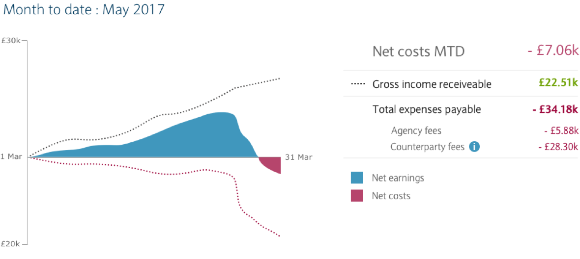
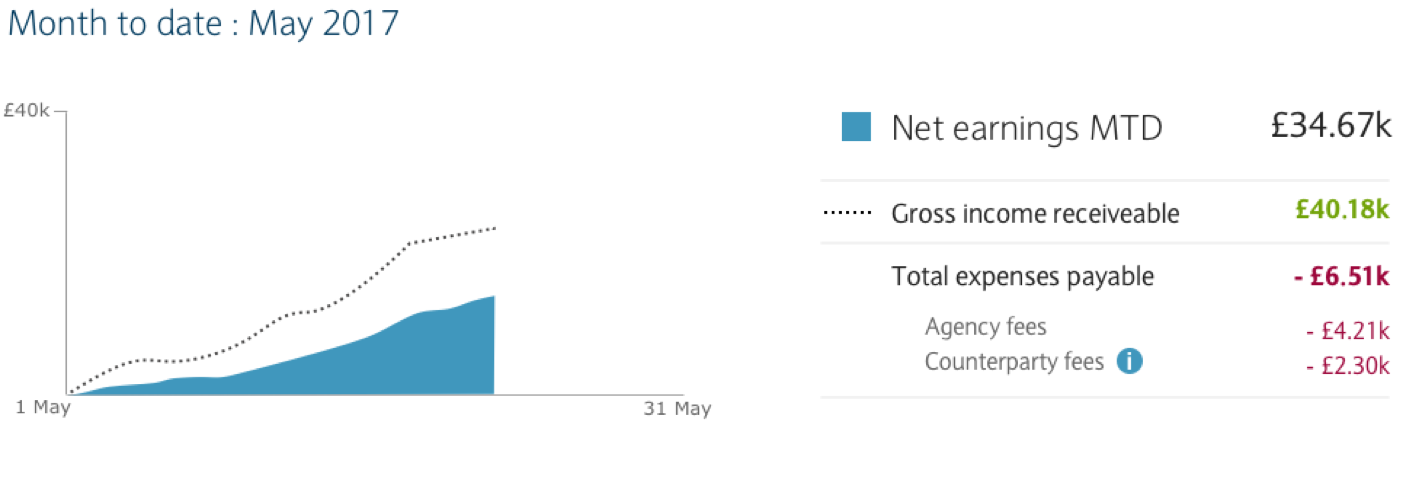
In the end, we came up with this chart, which changes its display according to whether the client account is in credit or debit. Where they are in credit, this simple version is displayed:
This snapshot of earnings proved to be enough information for 90% of use cases.
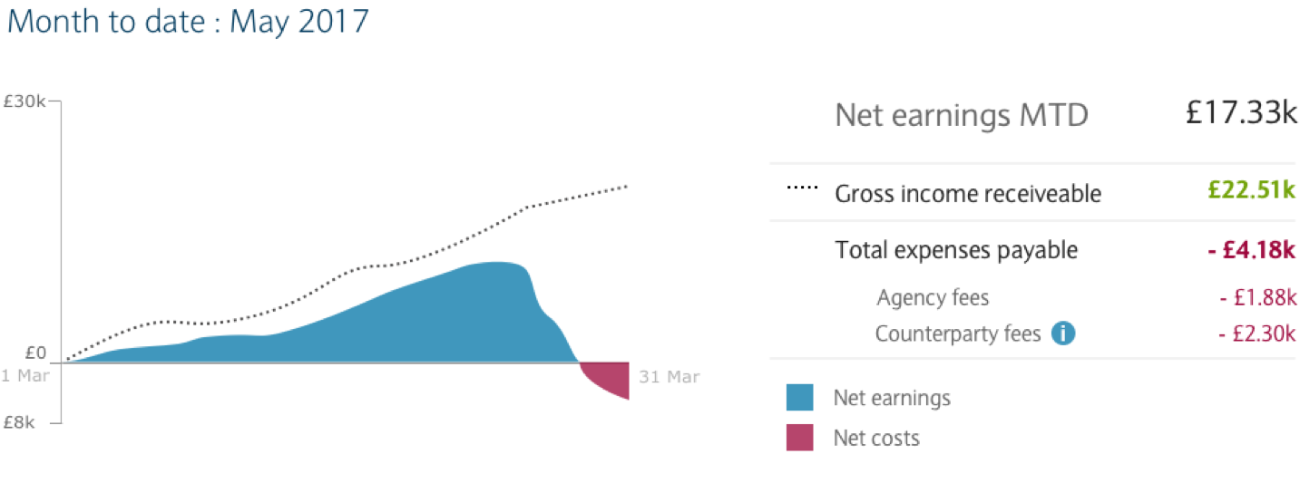
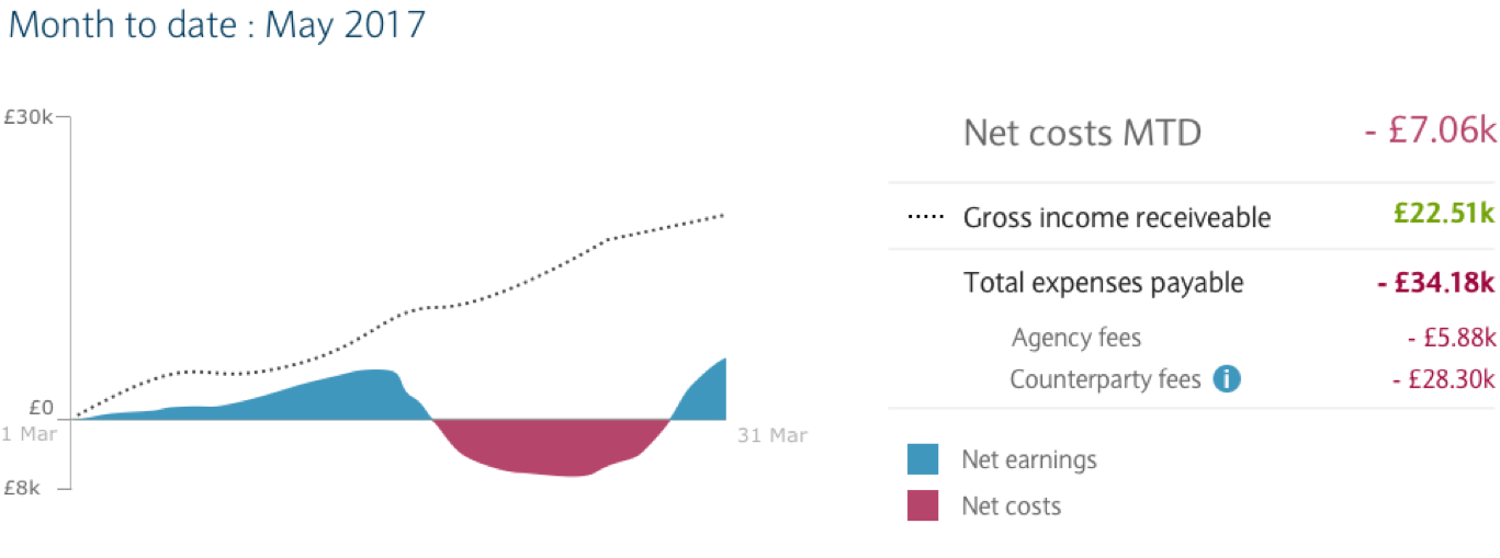
When the account in question has periods where they were in debit and had to pay costs, the chart switches to the following state, with a negative axis introduced:
This way, costs are implied by the difference between gross and net, with the negative axis only used where there is a net cost.
The breakthrough? Rather than clinging to the resolute belief that all costs must be shown all the time, we realised that our users really wanted a quick glance at the overall earnings situation. Furthermore, we realised that attempting to show a breakdown of costs only comes at the cost of legibility, and for our users the benefits didn’t make this worthwhile. As a compromise, we still make the detailed figures available in the key.
A satisfying problem to work on, then – and one which was finally vanquished by the proven approach of challenging assumptions and iterating on the solution until our user was satisfied.
What’s more, the client was very happy. It was a great example of how the process of user testing and iterating a design based on feedback can really work wonders.
Get in touch
Solving a complex business problem? You need experts by your side.
All business models have their pros and cons. But, when you consider the type of problems we help our clients to solve at Equal Experts, it’s worth thinking about the level of experience and the best consultancy approach to solve them.
If you’d like to find out more about working with us – get in touch. We’d love to hear from you.