Web forms allow users to share information with an organisation in a structured way, be it placing an order, making a request, or even offering an opinion. Good forms create positive relationships between the form maker and those filling it in.
On the flip side, complex and confusing web forms create negative experiences, with significant consequences. Some statistics bear this out:
88% are unlikely to return to a website after a bad experience
So, when creating a web form, it is vitally important to bear in mind how important it is to get it right.
Over the years, and across hundreds of web forms at different clients, we at UX Forms have noticed certain problems recurring – so in this article, we’re going to share the three most common issues, why they matter, and how they can best be avoided.
First Lesson: The Question
During this post, we’re going to tell the story of howEqual Expertsused UX Forms to help build their innovative ‘Strategic Maturity Assessment’ survey, so you can learn from their example, and apply the hard-won lessons to your own web forms in the future.
By way of background, the ‘Strategic Maturity Assessment’ survey helps organisations discover more about their resilience when faced with disruption, and which actions they should take to optimise their chances of success. Across 20 questions, the survey captures the unique characteristics of each organisation, so that the Equal Experts team can create a complimentary, bespoke report for each respondent within 36 hours.
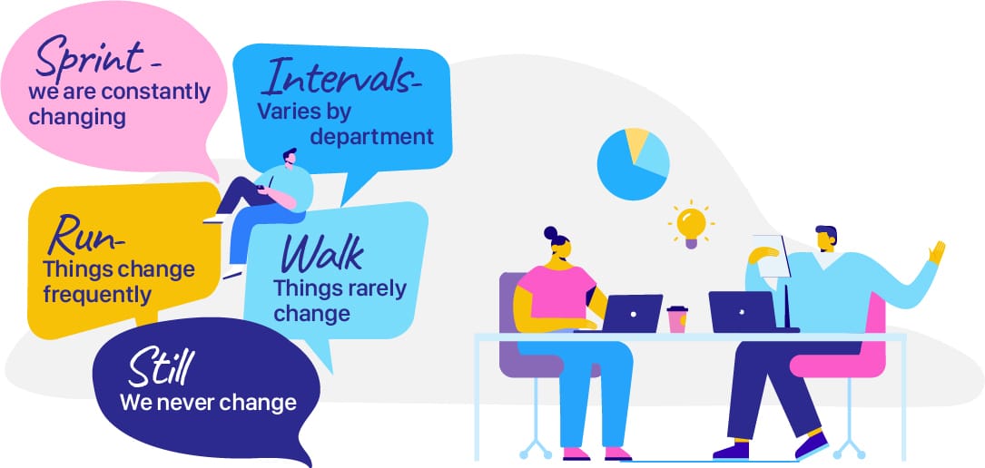
When it comes to questions, good ones are unbiased, simple to understand, and easy to answer. One question the survey makers at Equal Experts wanted to ask was, “How would you describe the pace of change at your organisation?” In the first draft of the questionnaire, the following options were given, to represent the high end of the spectrum:
Relentless – things change so often things never are given time to settle
High-paced – things change frequently, often without warning
When testing their questions with potential respondents, the Equal Experts team gathered feedback, epitomised by the following: “I interpreted the first two choices as negative. In some organisations, relentless change is part of what makes the company successful, whereas I interpreted the choices as what an employee would say if they were struggling to keep up.”
In essence, the question was (deliberately or not), ‘leading the witness’ by associating high speed of change with negative emotions. The advice from the UX Forms team was to change the options, so that they provided respondents with the ability to describe extremely fast and frequent change in a neutral way:
Second Lesson: The UI Elements
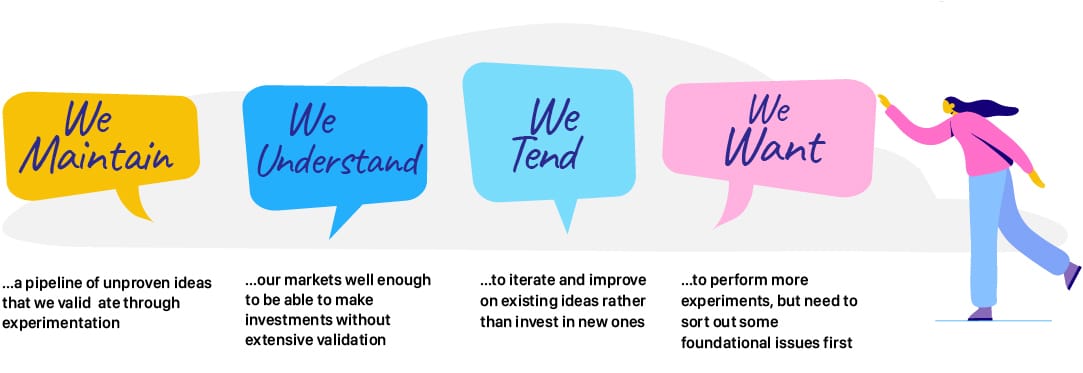
Another question in the original draft of the Strategic Maturity Assessment survey was: “What is your typical approach to developing new products and/or services?”, with a free text box left open for the respondent to provide their answer.
This immediately raised a red flag with the UX Forms team, who knew that free text boxes would create a significant challenge at scale. In particular, the accurate and speedy analysis of free text answers within 36 hours would likely prove impossible.
Again, through testing the question with users, the UX Forms team was able to help provide guidance on multiple choice options – radically simplifying the analysis whilst ensuring that respondents had a strong range of options from which to choose:
Third Lesson: Survey Structure
With the Strategic Maturity Assessment survey being a relatively long web form (20 questions), the Equal Experts team came to UX Forms with a question about how best to structure the form: should there be one question per page, or should all the questions be on one page?
Typically, the answer is driven by the context: when UX Forms workedwith Caredoc in Ireland, designing a web form to help call handlers capture information from callers with suspected Covid-19 symptoms, it made sense to have the entire form on one page. This was due to the fact that the information was typically shared in a non-linear fashion, and to have to navigate between pages to find the right question that matched the information being presented would have been frustrating and inefficient. In addition, the call handlers are domain experts, using the same form all day, every day. They didn’t need to be guided through an unfamiliar process – they simply needed the most efficient way of capturing all of the information passed to them in a phone conversation.
The question of which approach would maximise the number of completed forms could only be answered through user testing – by building two different versions of the form, randomising which link was sent out, and measuring the impact on response rate and completion. Being guided by evidence from the user is always the best way to go.
Conclusions
As the team at Equal Experts learned, designing effective web forms is hard, and it’s all too easy to trip up over common mistakes. Our best advice is to test, test and test with your users – and note that every form deployed to UX Forms automatically gets its own dashboard which provides real-time analysis on how people are using each form, which is ideal for measuring the effectiveness of changes implemented as a result of user-led research sessions across the service’s entire cohort. Listen to feedback, keep an eye out for areas of spontaneous consensus, and take action. Then test again! And, if possible, seek out the advice of web form experts, who’ve been through this hundreds of times, and can offer you the benefit of their hard-won wisdom.
We’re really pleased with how our Strategic Maturity Assessment form turned out. If you have any questions for us at UX Forms, don’t hesitate to drop us a line – we’d be happy to hear from you!
Get in touch
Solving a complex business problem? You need experts by your side.
All business models have their pros and cons. But, when you consider the type of problems we help our clients to solve at Equal Experts, it’s worth thinking about the level of experience and the best consultancy approach to solve them.
If you’d like to find out more about working with us – get in touch. We’d love to hear from you.