In previous posts I wrote about usability testing on a shoestring and how to scale it up.
Conducting usability testing is great, but if you don’t follow up with some actions, it’s just an academic exercise. For best results, you need to design the findings. So let’s talk about how to make that work for you.
You need a reliable workflow for getting information out of your usability testing sessions and into the minds of your team.
The first part of this is to make sure your testing generates usable output. Here are some things you don’t want: reams of documentation; mountains of handwritten paper notes that no one else can read; disparate session recordings strewn across half a dozen different machines or on a USB stick you can’t find. Instead, your research needs to produce clear, simple artifacts. Designing and researching government services for central government, we made video and brief notes with verbatim quotes or descriptions of people’s behaviour.
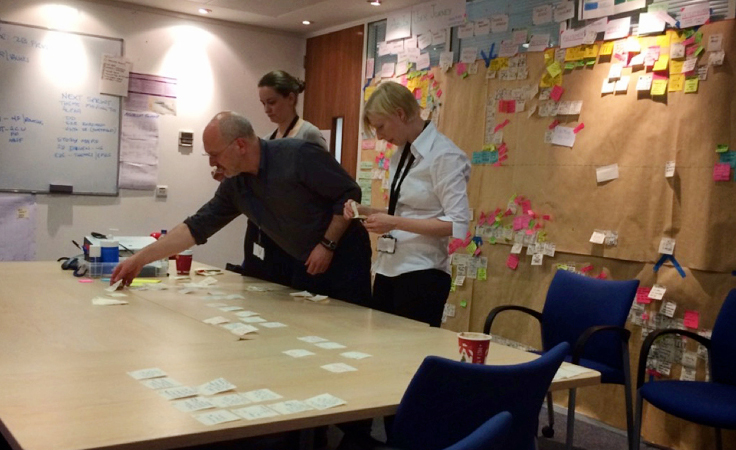
Post-it notes are your new best friend.
A great technique that we stole from our central government colleagues is to have the notetaker write down brief observations, one per post-it. It’s a really good idea to write with Sharpies or other thick pens, because (a) that stops you writing too much, and (b) it’s easily visible from a distance, which I’ll justify in a moment. When you’re done testing, take all the post-its and sort them into thematic groups based on which ones you think belong together. This is sometimes called ‘affinity sorting.’ Designing government services, we often ended up with themes based on different parts of the customer journey, like “doesn’t notice password strength indicator,” or “everyone understands how to edit their information,” but often we had more general topics too, like “nervousness around online transactions.”
Why post-its and not index or flashcards? Because post-its stick. You can sort them straight onto a wall in the team area. Buy the expensive post-its, because the cheap ones have lousy adhesive qualities. If you should be tempted to penny-pinch, think only this: That there’s some corner of an agile team area that is forever Autumn.
Show your workings.
When you’re done sorting, leave your post-it groups somewhere prominent for the team to look at. We put differently-coloured post-its by each group, summarising them, “Everyone remembers that awful time they pressed the Back button and lost all their data.” We also wrote a big note explaining what we were researching, where, and with whom. We realised after a while that we needed to use different colours and layouts every time, or people assumed it was just the same old stuff. If you can display your findings somewhere people might browse them over a cup of coffee, so much the better.
Use your workings to figure out what the story is.
Humans are notoriously flaky in what they recall, and I say that as a flaky human par excellence. Instead of getting hung up on one or two specific things you remember from testing, let the data do the talking — and by data, I mean your post-its. Twenty post-its about the navigation across 6 different participants probably means there’s something going on there. We wrote a couple of sentences about each group of themed post-its and emailed it to the team — that was the week’s “story” about what we’d learned. Doing this also helps you trim down 5 hours of footage into 5 minutes of clips, because now you know exactly which bits to show.
Show and tell, but especially show.
If you have video clips, introduce each one, play it, and then talk about why it’s useful. If you really want to make an impact, use Quicktime to splice together a supercut of several clips in which all the users have the same problem or have all taken the same wrong turn. But you don’t need video for showing. Bring in a board or show a slide with the affinity sort on it, “Look! All these comments are about the navigation.” If we went to do research off-site, we showed photos and told the story of where we’d been and who we’d met.
Your audience might need an on-ramp.
Information is harder to process without context, so provide some. Again, you’re telling a story – spend a minute or two saying what you’ve been doing, and with whom, and why. When developing government services, we found it helpful to explain our methods, so people understood why they were looking at a bunch of post-its on a board, or what a persona was. If a recording had poor sound or the participant’s speech was difficult to understand, we’d start the video 30 seconds earlier than the interesting bit, so people could get their ear in for the conversation. Sometimes it was still necessary to give a verbal recap afterwards.
Harness user pain as a force for change.
One of my favourite things about the entire central government project is rooms full of people all uncomfortable because they’re watching video of someone struggling with a government service. That point right there is when you have everyone’s attention — and a captive audience keen on making the pain stop. If you have a design solution, you can float it at this time, but it’s often more interesting to hear what others propose first. Your goal should be to bring this sort of discomfort to the team on a regular basis, because this is the fastest route to building the right thing for your users. Minds are changed in those rooms; the services get better.
Be smart about where and how you store your testing artifacts.
The only rule about what to do with your notes, videos and everything else is this – make sure you and the rest of your team can access them. We used our smartphones to take photographs of the post-it groups and their titles, so we could throw all the paper away and save the photo in a shared area. If you do this, zoom in to make sure you can actually read everything — this is why you needed to write with a Sharpie, by the way, because regular pen is hard to see in photos. Consider a shared folder where you park the artifacts from each testing session. Ideally, people should be able to browse. Think about how you are going to tie together commentary (the summary notes on your affinity sort), with video or other visuals, and how these can best be shared with the team — this could be as simple as storing everything from a particular session in the same folder. Don’t be a pinch-point. Everyone should still be able to find and access everything without you.
I hope this has been useful and given you some ideas about how to get the most out of usability testing.