As an interaction designer working on the Business Tax Account with HMRC, I need to keep a close eye on how users are respond to the services we’re providing them with.
Over five million people regularly use the Business Tax Account to file and pay their taxes, so getting it right is crucial.
Of course, we receive detailed analytics on how the service is performing, but while analytics reports can be exciting for some (myself included!), they are not necessarily very engaging for the wider team. The problem is that analytics don’t usually tell much of a story, without a deeper understanding of context.
Making feedback matter
With so many users we get a huge amount of valuable feedback, which helps us continue to shape the service around real user needs. Over time, our team has developed a couple of useful methods to make the feedback count.
Firstly, we hold a Live Service Review every other week. This in-depth discussion about the health of the service basically works like a check-up with the doctor, only instead of the patient’s vital signs we talk about how we’re measuring up to our service KPIs.
The Live Service Review helps our team stay in touch with reality. Without it, constantly working on new features and thinking about what the service will be could keep us so busy, we might lose sight of what the service is currently.
But we wanted to go a step further, and really make the many comments and ratings we receive from users to be a major part of our daily working space, so it could trigger conversations within the team at any point. We decided to experiment a little bit to try and maximise our exposure to valuable user feedback.
Gather round…
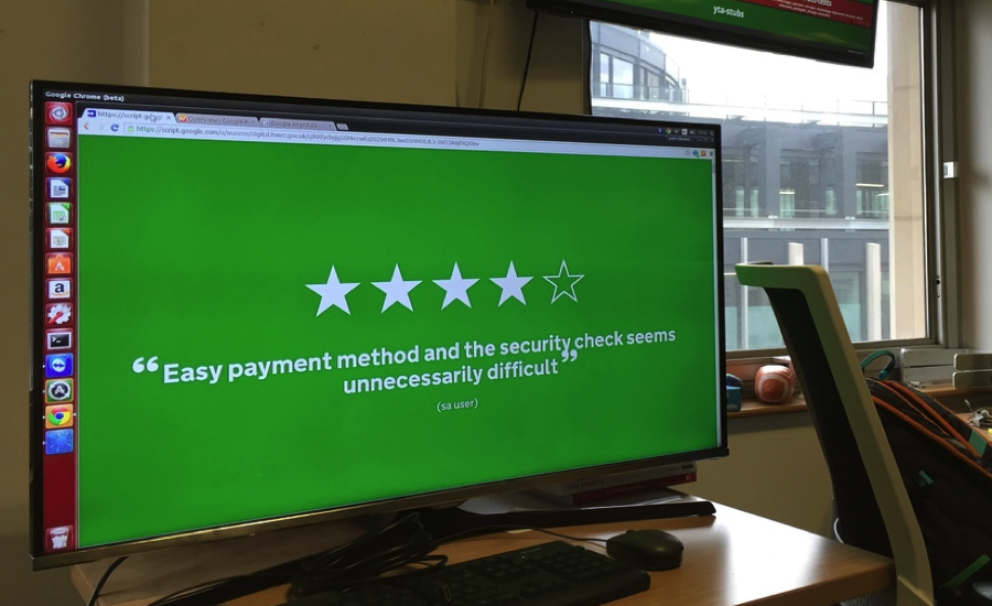
Our experimentation led us to create the Feedback Carousel, a script that collects feedback from users, organises it and then displays it prominently in our office:
Why make this when Government Digital Services (GDS) already provides a performance platform for every service to use? Well, we needed something less analytical and more human. We wanted to see the real stories behind those numbers.
That’s why we’ve used stars and colour-coded the feedback to show user sentiment. We think it looks more conversational, and we’ve found the carousel sparks curiosity among the team; people will stop to look at it and talk about what the data means. It’s almost like a bonfire we gather round it to chat about the comments, and how to address them (though it can’t toast marshmallows just yet).
The Feedback Carousel doesn’t provide quantitative data, and it’s not exhaustive, but it really helps us to feel in touch with the people using our service every day.
The feedback carousel is available on Github – feel free to try it yourself!
Get in touch
Solving a complex business problem? You need experts by your side.
All business models have their pros and cons. But, when you consider the type of problems we help our clients to solve at Equal Experts, it’s worth thinking about the level of experience and the best consultancy approach to solve them.
If you’d like to find out more about working with us – get in touch. We’d love to hear from you.